
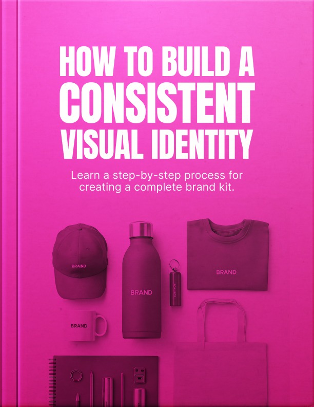


How To Build A Consistent Visual Identity – Book
This ebook teaches you how to build a strong and consistent visual identity that makes your business look professional and trustworthy. It provides clear, step-by-step guidance on choosing the right fonts, colors, logos, and images so your brand looks polished and aligned across every platform.
What’s Inside:
- Clear guidance on defining brand values and turning them into visual choices.
- Step-by-step instructions for choosing colors and fonts that build trust.
- Simple methods for creating a clean, professional wordmark logo.
- Easy rules for selecting photos, icons, and design elements that match.
- A practical system for building a brand guide and organizing files.
What You Will Learn:
- Why visual consistency builds trust and increases credibility.
- The most common design mistakes that make a business look amateur.
- Ways to choose colors and typography that match brand personality.
- The importance of using a simple brand guide to stay consistent.
- Smart strategies for growing and updating a brand without losing recognition.
With this ebook, you will gain practical strategies to create a brand that looks clear, confident, and professional. Whether you are just starting or improving an existing brand, this resource gives you the tools and structure you need to build long-term trust and stand out in the market.
Imagine you are sitting in a pre-op room, waiting for a complex surgery. You are nervous, but you trust the hospital’s reputation. Then the door opens and your surgeon walks in. Instead of crisp, clean scrubs, they are wearing a stained t-shirt and sweatpants that are slightly too short. Their hair is unkempt, and they are holding a coffee cup that looks like it was fished out of a trash bin. They smile and tell you they are ready to begin.
Logically, you know that clothes do not affect surgical skill. This person could be the most talented surgeon in the country, possessing steady hands and a brilliant mind. But in that moment, logic fails. Your brain screams one thing: Run.
We instinctively link appearance with competence. When visual cues do not match our expectations of professionalism, trust evaporates instantly. We assume that if someone is careless with their appearance, they will be careless with our health. Now, apply this to your business. You might offer the best consulting service, the most durable product, or the tastiest coffee in your city. But if your website looks broken, your emails use five different fonts, and your logo is a blurry pixelated image, you become the surgeon in the sweatpants. You are asking customers to trust you with their money while visually signalling that you do not pay attention to details.
This chapter addresses that disconnect. We are not here to discuss art or making things look “pretty” for vanity’s sake. We are here to talk about strategic business communication. We are going to explore how a defined visual identity (a brand kit) bridges the gap between an amateur hobbyist and a trusted professional.
The information provided in this ebook is intended solely for educational and informational purposes. The author does not accept any responsibility for the outcomes that may arise from the application of the material within. While efforts have been made to ensure the accuracy and relevance of the content, the author cannot be held accountable for any errors or omissions or for any consequences resulting from the use or misuse of the information provided. The responsibility for any actions taken based on the information in this ebook lies solely with the reader.
Related products
$6.00
$5.00
Original price was: $10.00.$9.00Current price is: $9.00.
$5.00
$7.00
$5.00







Reviews
There are no reviews yet.